Copier
import * as React from "react"
import { Frame, addPropertyControls, ControlType } from "framer"
import { Sun, Moon } from "lucide-react"
// Récupère le thème stocké
function getStoredTheme() {
return localStorage.getItem("currentToggleState")
}
// Met à jour le CSS pour la préférence de thème
function updateTheme(theme: "light" | "dark") {
if (typeof document !== "undefined") {
const styleTag = document.getElementsByTagName("style")[0]
const newCSS = styleTag.innerHTML.replace(
/prefers-color-scheme: \w+/,
`prefers-color-scheme: ${theme}`
)
styleTag.innerHTML = newCSS
}
window.dispatchEvent(new CustomEvent("themeChange"))
}
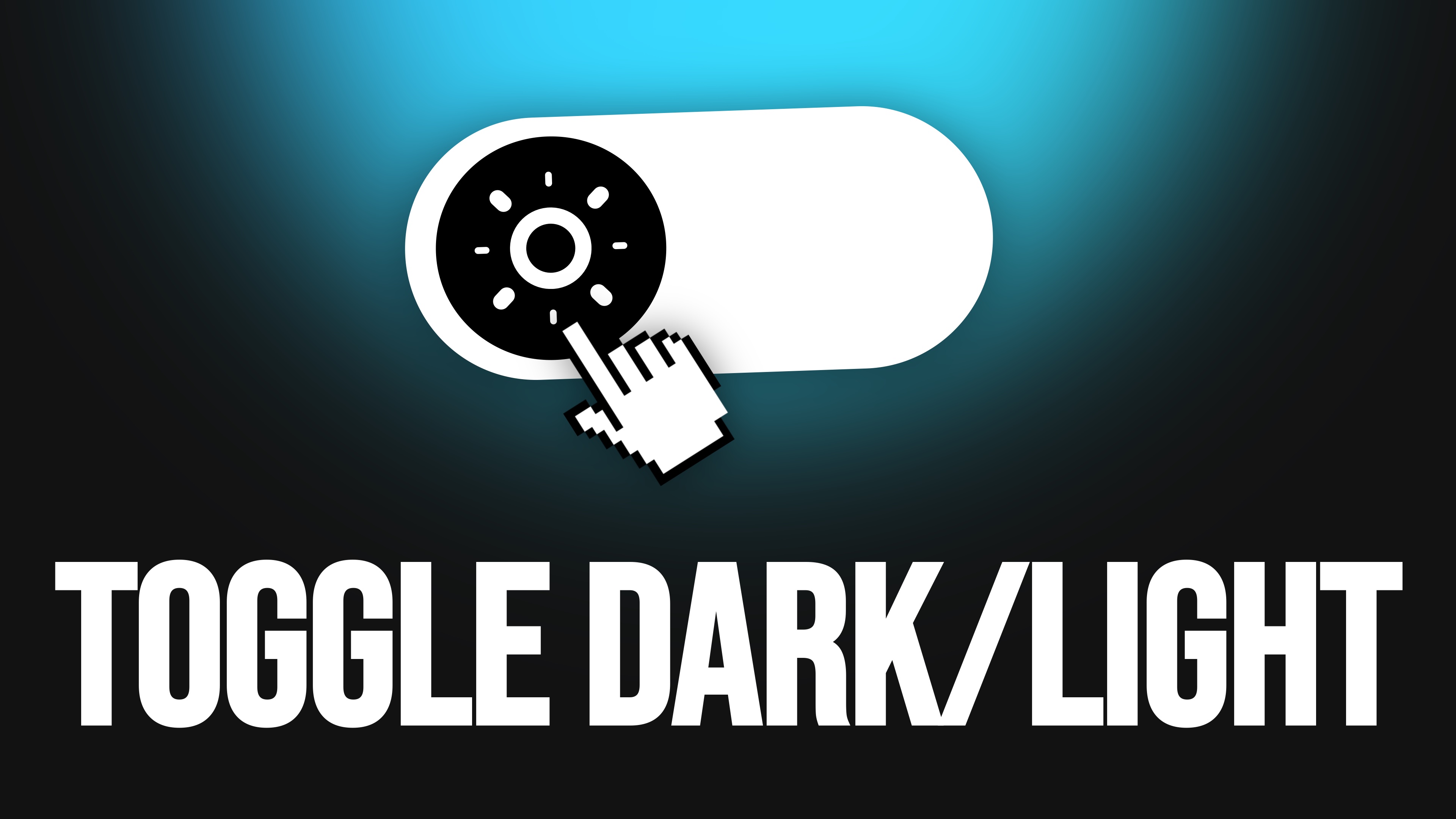
export function ThemeSwitch({
backgroundColor,
iconColor,
switchSize,
circleColor,
strokeWidth,
}: {
backgroundColor: string
iconColor: string
switchSize: number
circleColor: string
strokeWidth: number
}) {
const [isOn, setIsOn] = React.useState(false)
const [isThemeSet, setIsThemeSet] = React.useState(false)
// Bascule le thème et stocke l'état
const toggle = () => {
const newState = isOn ? "dark" : "light"
setIsOn(!isOn)
localStorage.setItem("currentToggleState", newState)
updateTheme(newState)
}
// Initialisation au chargement
React.useEffect(() => {
const stored = getStoredTheme()
if (stored === "light" || stored === "dark") {
setIsOn(stored === "light")
updateTheme(stored)
} else {
updateTheme("light")
}
setIsThemeSet(true)
}, [])
const circleSize = switchSize / 2 - switchSize / 8
const circlePadding = switchSize / 16
const iconSize = circleSize - circlePadding * 2
return (
<Frame
width={switchSize}
height={switchSize / 2}
background={backgroundColor}
style={{
borderRadius: switchSize / 4,
cursor: "pointer",
position: "relative",
display: "flex",
alignItems: "center",
justifyContent: "space-between",
padding: `0 ${switchSize / 8}px`,
}}
onClick={toggle}
>
{isThemeSet && (
<Frame
width={circleSize}
height={circleSize}
background={circleColor}
style={{
borderRadius: "50%",
position: "absolute",
left: isOn
? `calc(100% - ${circleSize + circlePadding}px)`
: `${circlePadding}px`,
transition: "left 0.2s",
display: "flex",
alignItems: "center",
justifyContent: "center",
padding: circlePadding,
}}
initial={false}
animate={{
left: isOn
? `calc(100% - ${circleSize + circlePadding}px)`
: `${circlePadding}px`,
}}
>
{isOn ? (
<Sun size={iconSize} color={iconColor} strokeWidth={strokeWidth} />
) : (
<Moon size={iconSize} color={iconColor} strokeWidth={strokeWidth} />
)}
</Frame>
)}
</Frame>
)
}
ThemeSwitch.defaultProps = {
backgroundColor: "#e0e0e0",
iconColor: "#000000",
switchSize: 60,
circleColor: "#ffffff",
strokeWidth: 2,
}
addPropertyControls(ThemeSwitch, {
backgroundColor: {
title: "Background",
type: ControlType.Color,
defaultValue: "#e0e0e0",
},
switchSize: {
title: "Size",
type: ControlType.Number,
defaultValue: 60,
min: 20,
max: 200,
step: 1,
},
circleColor: {
title: "Circle",
type: ControlType.Color,
defaultValue: "#ffffff",
},
iconColor: {
title: "Icon",
type: ControlType.Color,
defaultValue: "#000000",
},
strokeWidth: {
title: "Stroke",
type: ControlType.Number,
defaultValue: 2,
min: 1,
max: 5,
step: 0.5,
},
})